A statistical analysis
Amber L. Dunning
Eco 257 Quantitative Methods
Dr. Eric Dodge
Introduction:
When
examining the agricultural industry’s contribution to the
Summary of the
Data:
No new data
was created in this study. Instead, I
used data found by the United States Department of Agriculture National
Agriculture Statistics Service (also know as the USDA NASS) and the United
States Department of Commerce Bureau of Economic Analysis (also known as the
BEA). Information on how to examine the
raw data can be found at the end of this paper.
The data from these sites ranged from the years 1977 to 2003, however,
in order to maintain congruence between analyses, many of the statistics were
pulled from the years 1997 and 2002 due to the wide availability of data in
these two years. Also, in order to
simplify, certain analyses examine the data of 4 counties, each representing
either the minimum value, the maximum value, or the two values on either side
of the median. In order to deepen this
examination, congruent analyses will present the data of 3 counties, each
representing the least populated county, the most populated county, or the
median populated county. The
agricultural variables are widely diverse, and as the saying goes, comparing
apples to oranges, or in this case perhaps corn and wheat, can be somewhat difficult. Therefore, each statistical analysis will be
thoroughly explained as to what variables and measures the data contains as
each finding is presented in order to assure that no bias was present during
the completion of this project.
Summary
Statistics:
Below is a
table showing the summary statistics for the number of
Table 1. Summary
Statistics, Number of
|
|
Number
of Farms by County, 1997 |
Number
of Farms by County, 2002 |
|
|
|
|
|
Mean |
725.076087 |
655.3913043 |
|
Standard Error |
30.6542072 |
28.89713935 |
|
Median |
700.5 |
623.5 |
|
Mode |
735 |
676 |
|
Standard Deviation |
294.0248264 |
277.1716236 |
|
Sample Variance |
86450.59854 |
76824.10893 |
|
Range |
1481 |
1338 |
|
Minimum |
207 |
213 |
|
Maximum |
1688 |
1551 |
|
Count |
92 |
92 |
|
Confidence Level(95.0%) |
60.89082304 |
57.40062325 |
Below is a
table showing the summary statistics for the number of acres in
Table 2. Summary Statistics,
|
|
|
|
|
|
|
|
|
Mean |
168751.6739 |
163681.1957 |
|
Standard Error |
6482.881166 |
6741.461702 |
|
Median |
178154.5 |
172528.5 |
|
Mode |
#N/A |
#N/A |
|
Standard Deviation |
62181.61171 |
64661.82909 |
|
Sample Variance |
3866552835 |
4181152141 |
|
Range |
262147 |
279746 |
|
Minimum |
23836 |
20390 |
|
Maximum |
285983 |
300136 |
|
Count |
92 |
92 |
|
Confidence Level(95.0%) |
12877.44835 |
13391.08687 |
Below is a
table showing the summary statistics for the acres harvested, yield per acre
and average price per bushel for corn for the years 1994 to 2003. The mean values for area harvested (in 1000
acres), yield per harvested acres (in bushels), and average price per bushel
(in $) were 70,779.2 with a standard deviation of 2,437.5644, 132.07 with a
standard deviation of 8.3042, and 2.299 with a standard deviation of 0.4428,
respectively.
Table 3. Summary
Statistics for Corn, 1994-2003
|
CORN: |
Area
harvested (1000 acres) |
Yield
per harvested acre (bushels) |
Average
price per bushel ($) |
|
|
|
|
|
|
Mean |
70779.2 |
132.07 |
2.299 |
|
Standard Error |
770.825543 |
2.626025726 |
0.140019443 |
|
Median |
71789.5 |
134.1 |
2.29 |
|
Mode |
#N/A |
#N/A |
#N/A |
|
Standard Deviation |
2437.564395 |
8.304222487 |
0.442780357 |
|
Sample Variance |
5941720.178 |
68.96011111 |
0.196054444 |
|
Range |
7461 |
28.7 |
1.42 |
|
Minimum |
65210 |
113.5 |
1.82 |
|
Maximum |
72671 |
142.2 |
3.24 |
|
Sum |
707792 |
1320.7 |
22.99 |
|
Confidence Level(95.0%) |
1743.729852 |
5.940487432 |
0.316746228 |
Below is a table showing the summary statistics for the acres harvested, yield per acre and average price per bushel for wheat for the years 1994 to 2003. The mean values for area harvested (in 1000 acres), yield per harvested acres (in bushels), and average price per bushel (in $) were 56,135.8 with a standard deviation of 6,180.0845, 39.65 with a standard deviation of 3.3387, and 3.312 with a standard deviation of 0.7061, respectively.
Table 4. Summary
Statistics for Wheat, 1994-2003
|
WHEAT: |
Area
harvested (1000 acres) |
Yield
per harvested acre (bushels) |
Average
price per bushel ($) |
|
|
|
|
|
|
Mean |
56135.8 |
39.65 |
3.312 |
|
Standard Error |
1954.314309 |
1.055804064 |
0.223302485 |
|
Median |
56387.5 |
39.85 |
3.365 |
|
Mode |
#N/A |
#N/A |
#N/A |
|
Standard Deviation |
6180.08448 |
3.338745606 |
0.706144461 |
|
Sample Variance |
38193444.18 |
11.14722222 |
0.49864 |
|
Range |
17016 |
9.2 |
2.07 |
|
Minimum |
45824 |
35 |
2.48 |
|
Maximum |
62840 |
44.2 |
4.55 |
|
Count |
10 |
10 |
10 |
|
Confidence Level(95.0%) |
4420.969482 |
2.388396547 |
0.505145702 |
Looking at
Following
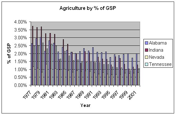
are two graphs depicting the percentage of gross state product contributed by
agricultural products.
Figure 1. Indiana’s Agricultural, Manufacturing, and
Service Industry Contribution to
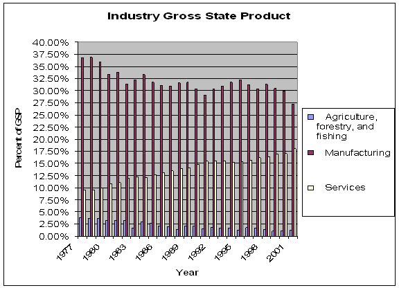
Figure 2.
Agricultural contributions to State Gross Product for
How do agricultural
trends vary by county and commodity? Are there similar trends amongst crops and
livestock?
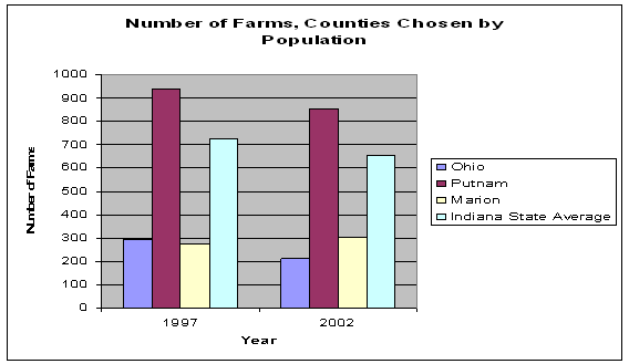
As
mentioned earlier, there will be two sets of county data presented. The first set was chosen by identifying the
minimum, maximum, and the two counties on either side of the median for the
number of farms per
Below are
figures 3 and 4 which depict the total number of farms per county for the years
1997 and 2002. In every depicted
instance, with the exception of
Figure 3. Number of
Farms per
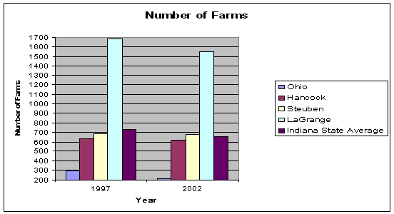
Figure 4. Number of
Farms per
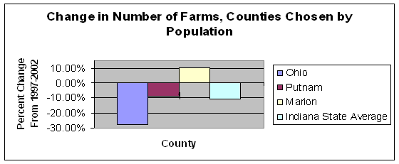
Below are
figures 5 and 6 which depict the percentage change of the number of farms in
each county between 1997 and 2002, measured in percentages.
Figure 5. Change in
number of farms per county between 1997 and 2002 for the summary statistics
counties
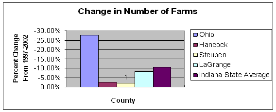
Figure 6. Change in
number of farms per county between 1997 and 2002 for the population counties
Since the
number of farms has, on the statewide average, declined, has this effected corn
and wheat production? Measuring the
production of corn and wheat based on total output by farm or by county would
be misleading since the above graphs depicted the reduction in the number of
farms per county. In order to remove
that issue, yet still examine any increases or decreases in production, the
below tables and graphs will look at bushels per acre. Measuring in bushels per acre allows us to
look at efficiency, which is the main goal of agricultural production. In the case of
Table 5. Corn
production for 1997 and 2002 measured in bushels per acre
|
|
1997 |
2002 |
Change |
|
|
Bushels per acre |
Bushels per acre |
Bushels per acre |
|
|
83.42957456 |
83.15544761 |
-0.27413 |
|
Hancock |
124.2229827 |
114.4490414 |
-9.77394 |
|
Steuben |
114.8544536 |
89.97880418 |
-24.8756 |
|
LaGrange |
119.4093426 |
92.91194802 |
-26.4974 |
|
|
83.42957456 |
83.15544761 |
-0.27413 |
|
Putnam |
110.9891047 |
138.1650172 |
27.17591 |
|
|
117.4252254 |
117.2852988 |
-0.13993 |
|
|
119.3509797 |
118.3138877 |
-1.03709 |
Figure 7. Corn
production for summary statistics counties for 1997 and 2002
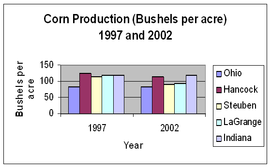
Figure 8. Corn
production for population counties for 1997 and 2002
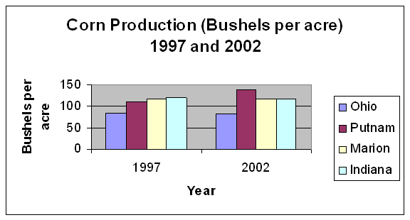
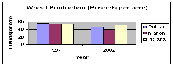
Table 6. Wheat
production for 1997 and 2002 measured in bushels per acre
|
|
1997 |
2002 |
Change |
|
|
Bushels per acre |
Bushels per acre |
Bushels per acre |
|
|
- |
- |
- |
|
Hancock |
58.61162342 |
53.76617874 |
-4.84544 |
|
Steuben |
50.83511825 |
54.1 |
3.264882 |
|
LaGrange |
52.1945973 |
52.61345253 |
0.418855 |
|
|
- |
- |
- |
|
Putnam |
55.15108199 |
46.91341705 |
-8.23766 |
|
|
53.90073529 |
40.16938111 |
-13.7314 |
|
|
53.59396236 |
51.17236297 |
-2.4216 |
Figure 9. Wheat
production for summary statistics counties for 1997 and 2002
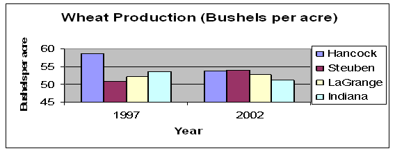
Figure 10. Wheat
production for population counties for 1997 and 2002
After
examining crop production, I decided to look at number of livestock raised per
farm. However, this data does not
include a measure to remove the reduction of the number of farms from the per
farm calculation. Therefore, please note
that an increase or decrease in livestock per farm may not be representative of
efficiency changes, but rather shows the differences between 1997 numbers per
farm and 2002 numbers per farm. Below
are tables 7 and 8 and figures 11, 12, 13 and 14 which illustrate the changes
in hogs raised per farm and cattle raised per farm. Please also note that data was not available
for Ohio County or Marion County hog production in either one or both years and
therefore a symbol (-) was entered in place of data.
Table 7. Hogs raised
in 1997 and 2002, measured in hogs per farm
|
|
1997 |
2002 |
Change |
|
|
Hogs per farm |
Hogs per farm |
Hogs per farm |
|
|
- |
- |
- |
|
Hancock |
161.5384615 |
842.7727273 |
681.2343 |
|
Steuben |
218.5757576 |
141.5625 |
-77.0133 |
|
LaGrange |
244.7285714 |
225.6504065 |
-19.0782 |
|
|
- |
- |
- |
|
Putnam |
406.3195876 |
839.1320755 |
432.8125 |
|
|
85.77777778 |
- |
- |
|
|
576.6964312 |
851.1304135 |
274.434 |
Figure 11. Hogs
raised in summary statistics counties for 1997 and 2002
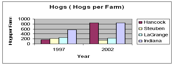
Figure 12. Hogs
raised in population counties for 1997 and 2002
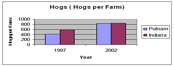
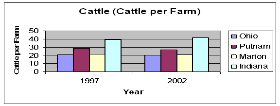
Table 8. Cattle
raised in 1997 and 2002, measured in hogs per farm
|
|
1997 |
2002 |
Change |
|
|
Cattle per farm |
Cattle per farm |
Cattle per farm |
|
|
20.51977401 |
19.91818182 |
-0.60159 |
|
Hancock |
23.47337278 |
21.96212121 |
-1.51125 |
|
Steuben |
51.22404372 |
61.62676056 |
10.40272 |
|
LaGrange |
40.8331814 |
44.09950249 |
3.266321 |
|
|
20.51977401 |
19.91818182 |
-0.60159 |
|
Putnam |
28.99322799 |
26.93693694 |
-2.05629 |
|
|
21.3125 |
20.51351351 |
-0.79899 |
|
|
39.1304818 |
41.72267931 |
2.592198 |
Figure 13. Cattle
raised in summary statistics counties for 1997 and 2002
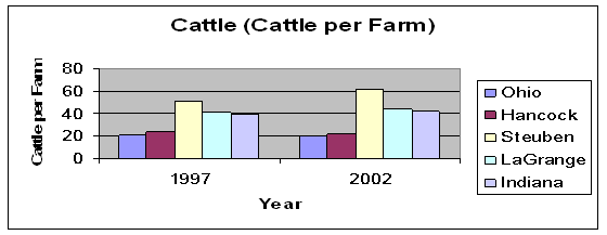
Figure 14. Cattle
raised in population counties for 1997 and 2002.
What types of
relationships are present between corn and wheat production versus the price
paid for that commodity?
The
following covariance table shows the relationships between the different
variables examined for corn. There are
positive relationships found between area planted and area harvested, area
planted and yield per harvested acre, area planted and production, area
harvested and yield per harvested acre, area harvested and production, yield
per harvested acre and production, and average price per bushel and value of
production. There are negative relationships
between area planted and average price per bushel, area planted and value of
production, area harvested and average price per bushel, area harvested and
value of production, yield per harvested acre and average price per bushel,
yield per acre and value of production, production and average price per
bushel, and production and value of production.
Table 9. Covariance
Table for Corn variables
|
|
Area planted (1000 acres) |
Area harvested (1000 acres) |
Yield per harvested acre (bushels) |
Production (1000 bushels) |
Average price per bushel ($) |
Value of production ($1000) |
|
Area planted (1000 acres) |
6132005 |
|
|
|
|
|
|
Area harvested (1000 acres) |
5337853 |
5347548 |
|
|
|
|
|
Yield per harvested acre
(bushels) |
11511.34 |
10238.47 |
62.0641 |
|
|
|
|
Production (1000 bushels) |
1.46E+09 |
1.38E+09 |
5569333 |
5.57E+11 |
|
|
|
Average price per bushel
($) |
-575.929 |
-486.389 |
-2.48543 |
-231118 |
0.176449 |
|
|
Value of production ($1000) |
-1E+09 |
-5.4E+08 |
-7311097 |
-5.6E+11 |
982613.8 |
7.61E+12 |
The following correlation table shows the strength of the relationships between the variables. A strong positive relationship is signified by a value that is close to 1, such as the relationship between yield per harvested acre and production (0.947). A strong negative relationship will have a value close to -1, such as yield per harvested acre and average price per bushel (-0.751).
Table 10. Correlation
Table for Corn variables
|
|
Area planted (1000 acres) |
Area harvested (1000 acres) |
Yield per harvested acre (bushels) |
Production (1000 bushels) |
Average price per bushel ($) |
Value of production ($1000) |
|
Area planted (1000 acres) |
1 |
|
|
|
|
|
|
Area harvested (1000 acres) |
0.9322 |
1 |
|
|
|
|
|
Yield per harvested acre
(bushels) |
0.5901 |
0.562 |
1 |
|
|
|
|
Production (1000 bushels) |
0.7887 |
0.7972 |
0.947 |
1 |
|
|
|
Average price per bushel
($) |
-0.554 |
-0.501 |
-0.751 |
-0.737 |
1 |
|
|
Value of production ($1000) |
-0.149 |
-0.085 |
-0.336 |
-0.273 |
0.8482 |
1 |
The following covariance table shows the relationships between the different variables examined for wheat. There are positive relationships found between area planted and area harvested, area planted and production, area planted and average price per bushel, area planted and value of production, area harvested and production, area harvested and average price per bushel, area harvested and value of production, yield per harvested acre and production, production and value of production, and average price per bushel and value of production. There are negative relationships between area planted and yield per harvested acre, area harvested and yield per harvested acre, yield per harvested acre and average price per bushel, yield per acre and value of production, and production and average price per bushel.
Table 11. Covariance
Table for Wheat variables
|
|
Area planted (1000 acres) |
Area harvested (1000 acres) |
Yield per harvested acre (bushels) |
Production (1000 bushels) |
Average price per bushel ($) |
Value of production ($1000) |
|
Area planted (1000 acres) |
24676570 |
|
|
|
|
|
|
Area harvested (1000 acres) |
27061024 |
34374100 |
|
|
|
|
|
Yield per harvested acre
(bushels) |
-6742.46 |
-2901.61 |
10.0325 |
|
|
|
|
Production (1000 bushels) |
6.45E+08 |
1.13E+09 |
435267.7 |
6.61E+10 |
|
|
|
Average price per bushel
($) |
2085.208 |
1739.138 |
-1.6156 |
-24583.1 |
0.448776 |
|
|
Value of production ($1000) |
6.7E+09 |
7.5E+09 |
-2053276 |
1.64E+11 |
911761.3 |
2.58E+12 |
In the following correlation table, the strongest positive relationship is found between area planted and area harvested (0.9292). The strongest negative relationship is found between yield per harvested acre and average price per bushel (-0.7614).
Table 12. Correlation
Table for Wheat variables
|
|
Area planted (1000 acres) |
Area harvested (1000 acres) |
Yield per harvested acre (bushels) |
Production (1000 bushels) |
Average price per bushel ($) |
Value of production ($1000) |
|
Area planted (1000 acres) |
1 |
|
|
|
|
|
|
Area harvested (1000 acres) |
0.9292 |
1 |
|
|
|
|
|
Yield per harvested acre
(bushels) |
-0.4285 |
-0.1562 |
1 |
|
|
|
|
Production (1000 bushels) |
0.5048 |
0.7494 |
0.5345 |
1 |
|
|
|
Average price per bushel
($) |
0.6266 |
0.4428 |
-0.7614 |
-0.143 |
1 |
|
|
Value of production ($1000) |
0.8408 |
0.7966 |
-0.4038 |
0.3979 |
0.8479 |
1 |
|
|
|
|
|
|
|
|
Are there differences
between the price paid for corn and wheat?
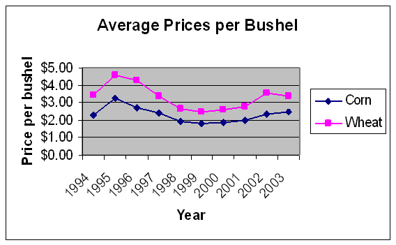
Below is a
graph showing the differences in the average prices per bushel for corn and
wheat during the years 1994-2003. It
appears that wheat prices are always higher than corn prices, for the average
price per bushel.
Figure 15. Comparison
between corn and wheat prices between 1994-2003.
In order to test this idea, I have set up the following null and alternative hypotheses, the null hypothesis stating that the difference between the average price per bushel for corn and wheat equals zero, or in other words, that the average price per bushel for corn and wheat are the same. The alternative hypothesis is that there is a difference between the average price per bushel for wheat and corn. The hypotheses are listed below:
Ho:
(μ wheat – μ corn) = 0
Ha:
(μ wheat – μ corn) ≠ 0
Since there are only 10 years (observations) in this sample, a t-test with 9 degrees of freedom must be used. I chose a= 0.05. With a p-value of 0.0000023772, we would not accept the null hypothesis, and conclude that there is a difference between the average price per bushel for wheat and the average price per bushel for corn. Below are the results of the t-test:
Table 13. T-test
results for hypothesized mean difference of 0
|
t-Test: Paired Two Sample for Means |
|
|
|
Average Price Per Bushel |
|
|
|
|
WHEAT |
CORN |
|
Mean |
3.312 |
2.299 |
|
Variance |
0.49864 |
0.196054444 |
|
Observations |
10 |
10 |
|
Pearson Correlation |
0.962124382 |
|
|
Hypothesized Mean Difference |
0 |
|
|
Df |
9 |
|
|
t Stat |
10.50174887 |
|
|
P(T<=t) one-tail |
1.1886E-06 |
|
|
t Critical one-tail |
1.833113856 |
|
|
P(T<=t) two-tail |
2.3772E-06 |
|
|
t Critical two-tail |
2.262158887 |
|
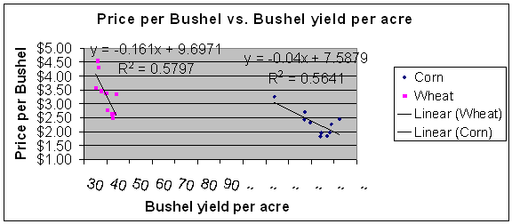
Figure 16 shows the bushels
yielded per acre plotted against the average prices per bushel for corn and
wheat between the years of 1994 and 2003.
The equation for the regression line for wheat is y = 9.6971 – 0.161 x. The r-squared value is 0.5797 which means
that 57.97% of the data can be explained by this line. The equation for the regression line for corn
is y = 7.5879 – 0.04 x. The r-squared
value is 0.5641 which means that 56.41% of the data can be explained by this
line.
Figure 16.
Relationship between bushels per acre and price per bushel for corn and wheat
for 1994-2003
Following
are Tables 14 and 15, which are regression analysis tables for wheat and
corn. The average price per bushel for
each commodity was chosen as the dependent variable due to the fact that it
makes economic sense for price to fluctuate due to a large harvest or a poor
harvest, as well as the total amount of the commodity that was harvested. The variables are the same variables used in
Tables 9-12, however, after noticing symptoms of multicollinearity, the
variables related to the area planted, production, and value of production were
removed in order to present a more accurate test. For wheat, Table 14, the adjusted r-squared
value is 0.5979 which means that 59.79% of the average price per bushel is
explained by the area harvested and the yield per harvested acre. For multiple independent variables, this is a
very good result. This also passes the
F-test since the F-value is 0.0171 we can say this model is significant. The
intercept (in literal terms) states that if there were zero acres harvested at
a yield of zero bushels per harvested acre, then the average price per bushel
of wheat would be $7.1331. The
coefficient for the area harvested says that for every additional 1000 acres
harvested, the average price per bushel of wheat would increase $0.00003792 and
for every additional bushel yielded from a harvested acre, the average price
per bushel of wheat would increase -$0.1501 (or decrease by $0.1501). The
intercept for the average price per bushel of wheat can be accepted at a
97.8221% confidence level. The
coefficient for the area harvested can be accepted at an 83.5161% confidence
level. The coefficient for the yield per
harvested acre for wheat can be accepted at 98.7155% confidence level.
Table 14. Regression
statistics for wheat
|
PRICE OF WHEAT |
|
|
|
|
|
|
|
|
|
|
|
|
|
Regression
Statistics |
|
|
|
|
|
|
Multiple R |
0.828988775 |
|
|
|
|
|
|
0.68722239 |
|
|
|
|
|
Adjusted |
0.597857358 |
|
|
|
|
|
Standard Error |
0.447799516 |
|
|
|
|
|
Observations |
10 |
|
|
|
|
|
|
|
|
|
|
|
|
ANOVA |
|
|
|
|
|
|
|
df |
SS |
MS |
F |
Significance F |
|
Regression |
2 |
3.084089152 |
1.542044576 |
7.690059283 |
0.017112947 |
|
Residual |
7 |
1.403670848 |
0.200524407 |
|
|
|
Total |
9 |
4.48776 |
|
|
|
|
|
|
|
|
|
|
|
|
Coefficients |
Standard Error |
t Stat |
P-value |
|
|
Intercept |
7.133117798 |
2.427988386 |
2.937871466 |
0.021779068 |
|
|
Area harvested (1000 acres) |
3.79269E-05 |
2.44532E-05 |
1.550999404 |
0.164838919 |
|
|
Yield per harvested acre (bushels) |
-0.150067388 |
0.045263303 |
-3.315431688 |
0.012845348 |
|
For corn, in Table 15 below, the adjusted r-squared value is 0.4512 which means that 45.12% of the average price per bushel is explained by the area harvested and the yield per harvested acre. For multiple independent variables, this is a good result. This also passes the F-test since the F-value is 0.0508 we can say this model is significant. The intercept (in literal terms) states that if there were zero acres harvested at a yield of zero bushels per harvested acre, then the average price per bushel of corn would be $8.6107. The coefficient for the area harvested says that for every additional 1000 acres harvested, the average price per bushel of corn would increase -$0.00002088 (or decrease by $0.00002088) and for every additional bushel yielded from a harvested acre, the average price per bushel of corn would increase -$0.0366 (or decrease by $0.0366). The intercept for the average price per bushel of wheat can be accepted at a 96.9809% confidence level. The coefficient for the area harvested can be accepted at a 28.8292% confidence level. The coefficient for the yield per harvested acre for wheat can be accepted at 94.4951% confidence level.
Table 15. Regression
statistics for corn
|
PRICE OF CORN |
|
|
|
|
|
|
|
|
|
|
|
|
|
Regression Statistics |
|
|
|
|
|
|
Multiple R |
0.757046918 |
|
|
|
|
|
|
0.573120037 |
|
|
|
|
|
Adjusted |
0.451154333 |
|
|
|
|
|
Standard Error |
0.328029926 |
|
|
|
|
|
Observations |
10 |
|
|
|
|
|
|
|
|
|
|
|
|
ANOVA |
|
|
|
|
|
|
|
df |
SS |
MS |
F |
Significance F |
|
Regression |
2 |
1.011264574 |
0.50563229 |
4.6990262 |
0.050824159 |
|
Residual |
7 |
0.753225426 |
0.10760363 |
|
|
|
Total |
9 |
1.76449 |
|
|
|
|
|
|
|
|
|
|
|
|
Coefficients |
Standard Error |
t Stat |
P-value |
|
|
Intercept |
8.61067862 |
3.177152936 |
2.71018701 |
0.0301908 |
|
|
Area harvested (1000 acres) |
-2.08764E-05 |
5.42324E-05 |
-0.3849433 |
0.7117083 |
|
|
Yield per harvested acre
(bushels) |
-0.036602281 |
0.015919012 |
-2.2992809 |
0.0550494 |
|
Conclusions
From this
project, we can conclude that the average number of farms per county has
decreased from 1997 to 2002. We can also
conclude that the contribution of the agriculture industry to the